How we helped a local caterer
redefine the way they sell.
The Problem
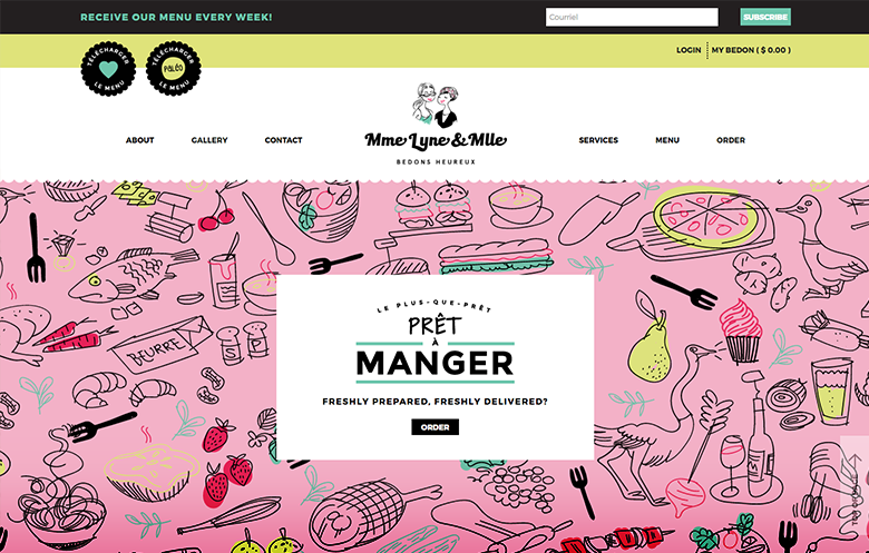
Mme Lyne Caterer is a local catering company who has been in business for over 20 years. While her local audience has always remained loyal, the new generation is less enthusiastic about the “old-school” process for ordering ready-made meals from the company.
The Results
We completely revamped her sales process and created a new brand that speaks to the new generation, while maintaining its authentic brand history for loyal customers.
Our Strategy
Improved product presentation and user experience
The company offers a lot of different services so we had to make sure the website flow was easy and clear so that users know exactly what they do and what they can expect from each service.
Conversion optimized checkout process
We needed to make sure the checkout process was optimized to increase sale of product cross-sells and upsell options such as extra protein add-on, family-size option, and dessert add-on.
Strategically placed content and calls-to-action
We needed to be strategic about how to explain information (e.g. delivery, pick up, containers restrictions and how to proceed to order online, etc…) clearly without deterring users.
Brand image and design
The brand played an important role in attracting a new demographic of users while retaining old users. Our design strategy found a perfect middle ground for the two worlds to interact.
Mélanie Boucher, Art Director, Illustrator
How Video Helped Crossfit TMR
Explain Who they Really Are
The Problem
The fitness industry is tough.
New gyms often have a difficult time getting recognized and positioning themselves against all the the other health and fitness programs available.
Crossfit is one industry that had exploded in popularity, and with that came a lot of new gyms and competition.
When we first started working with Crossfit TMR – they were a small gym who needed to stand out from the crowd and get the word out about what made them awesome.
The Results
The video ended up being very effective for Crossfit TMR.
They now had a quick, simple way to demonstrate to potential customers what they believe it, why people should choose them, and who they were as a company and, more importantly, a community.
The Solution
Create an amazing explainer video
We decided the best thing to do was to show them what made Crossfit, and the environment at Crossfit TMR so special with a really powerful video.
Creating a personal connection
Crossfit is a very interactive sport. It’s done as group and there’s a strong team dynamic.
By putting the members front and center, we were able demonstrate a feeling of community at Crossfit TMR and attract people looking for the same thing.
Educating About Crossfit
There is some confusion and misunderstanding about what crossfit actually is. We decided to dedicate part of our efforts to educating the audience all about the awesome fitness program and how it’s different from a regular gym.
Promoting Core Values
By demonstrating the core values, we helped people understand that Crossfit TMR wasn’t just a gym it was a community, a family, a lifestyle, a group of people who cared about fitness, but didn’t take themselves too seriously. They were looking for a fun, hardworking, engaging atmosphere to better themselves.
How we grew Inside Fitness
subscriptions by 1189% in 6 months
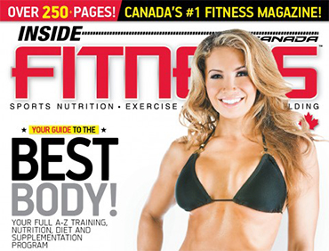

From 83 subscribers to 987 new subscriptions in 6 months.
The Problem
Inside Fitness is Canada’s #1 Fitness magazine. They dominate the market in print magazines, however, when they came to us – their online engagement and sales we’re very weak. When we asked what size their email list was, they looked almost embarrassed to say under 100 (83 to be exact). Their online magazine subscriptions purchases were also almost non-existing.
The Results
We implemented multiple strategies to engage users to subscribe and drive traffic to paid subscription landing pages, which helped increase the total email subscriptions by 1189% in 6 months and contributed to over 100 subscription sales during a magazine launch in January 2016.
1189% Increase in New Email Subscriptions
100+ Magazine Subscription Sales
Our Strategy
Improved Website Calls To Action
We noticed that the Inside Fitness website didn’t have any calls-to-action to get people to subscribe. So we added several banners and popups using SumoMe to get visitors to signup.
Created Lead Generation Survey
Using HotJar we created a timed popup survey with a single question “Would you be interested in learning more about our digital magazine subscriptions”
Building Segmented Landing Pages
We built 4 landing pages for each of Inside Fitness’ audience segments. This allowed us to communicate the benefits of the digital subscription in ways that connected to the needs of their audience.
Targeted Email Campaigns
Email marketing is a powerful way we were able to connect with users directly and send them targeted emails that engaged Inside Fitness users with relevant offers and content.
Analytics Tracking
Implemented many qualitative analytics tracking tools including heat-mapping and scroll-mapping which would allow us to see what parts of the page users were and were not engaging.
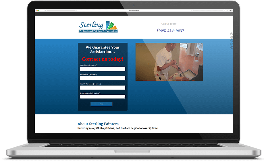
How we helped Sterling Painters
dominate search engines and increase sales.
The Problem
Although they ranked well on Google in their area, Sterling Painters weren’t getting as many online inquiries as they expected. And like many businesses, most of their new clients were coming from referrals and word of mouth.
The problem? Their outdated (15-year-old!) website, wasn’t communicating their brand message and personality anymore. It was time to give Sterling Painters a much-needed facelift and get the Internet working in their favor.
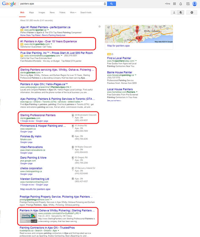
The Results
We absolutely dominated the search results from an SEO standpoint.
Our main goal was to make Sterling more money and to get them more actionable results. Because of the video and the clear calls to action throughout the site, her leads increased along with her customers.
Christine later told us, “The video just stands out so much on Google. I’ve never had anything work better for my business.”
Our Strategy
The website
We decided to not only rebuild Sterling Painter’s website, but to give it the clear branding, unique selling points, and personality it needed to really engage with visitors and get them to take action.
Video creation
We created a video featuring Christine telling people about Sterling, what they do, and why they’re the best. Because Christine is naturally passionate about her business and has been the backbone of its success for many years, her sterling personality shined right through the video. It easily attracted attention, providing a strong, passionate, identifiable personality for the brand.
The video was short enough so it wouldn’t lose viewers’ attention, but long enough to get the necessary key selling points across.
Engage users to take action
We put clear call-to-action promptings throughout Sterling’s newly modernized website to create urgency for users to contact Sterling (and also provide their email for future marketing efforts).
SEO
Because Sterling’s site was already ranked well on Google, we created an SEO campaign to rank the video on the first page for a variety of terms in addition to her website.
How we helped a local chiropractic clinic
become fully accessible to their customers.
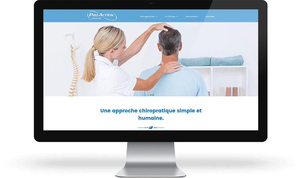
The Problem
ProAction’s online presence wasn’t making the company any money, because it lacked a clear goal. Many customers were unable to find the information they wanted on the site, due to its confusing navigation and structure. In short, the website existed for no specific reason.
The Results
ProAction’s website visitors now find it easy to gain a complete understanding of the company’s wide range of services and techniques. The website also now serves as a powerful sales tool, driving readers to ask specific questions and schedule appointments.
Our Strategy
Redefining the site’s positioning
The original website cast far too broad a net, positioning itself as a general-information chiropractic health website — without any clear message or call to action. We repositioned the site as a patient-centric guide to specific treatments, aligned around each patient’s needs and health goals — as well as a tool for getting in touch with the clinic.
Restructuring the site’s content to provide a streamlined user experience
We restructured the site’s navigation and content to guide each customer to information on treatments that match their individual needs. All information on the site is now broken down clearly into sections and subsections, so each customer segment can find exactly the facts they’re looking for.
Empowering visitors to reach out at any moment
We supplemented the site’s existing “Contact Us” page with short contact forms on various pages, to enable visitors to contact the clinic at any moment they have a question, or want to schedule an appointment.
Upgrading the site’s visual design
We redesigned the site’s appearance to match ProAction identity: simple, functional and professional.